No one can deny how important a book’s cover really is --- it’s your first impression of the story, it conveys a mood, a sense of mystery, a character. Either it draws you in or it doesn’t. That’s why Todd Strasser had such strong opinions about what the cover of his latest book, THE BEAST OF CRETACEA --- an epic space adventure based on MOBY DICK --- would look like. He takes us on the cover’s journey from first draft to final image, below. Check out its evolution --- we’re willing to bet this is one cover that will definitely have you itching to read the tale inside!
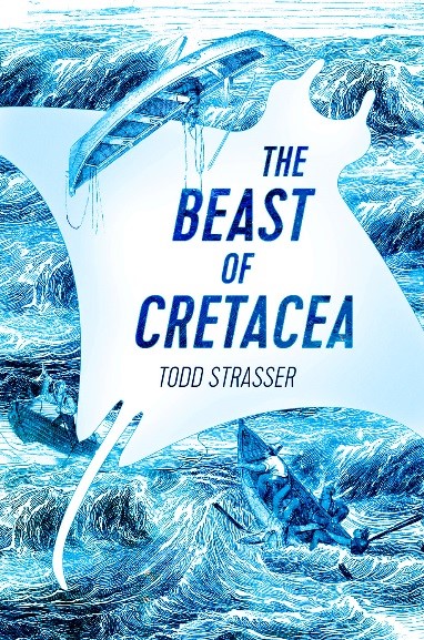
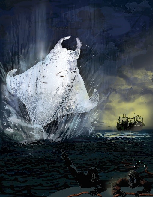
The first cover I was shown for THE BEAST OF CRETACEA was this white and blue illustration. Since the book is a futuristic quasi-retelling of MOBY DICK, I understood where the artist was coming from. And while I liked the idea of the sailors doing battle with the beast, I felt that the cover failed to convey any sense of futurism or science fiction. A friend in the fashion business even said the manta ray-like beast reminded her of a woman’s dress. Straps, bust, waist and widening skirt (image on left).
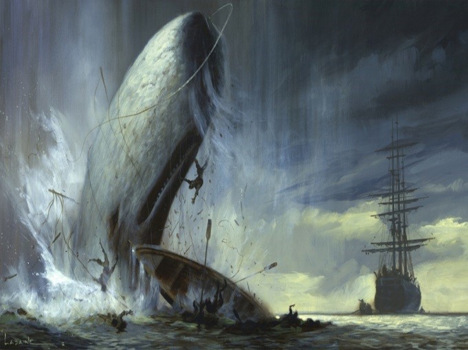
Wanting to offer my publisher an alternate suggestion, but being utterly without artistic talent, I asked my daughter, Lia, a graphic artist and illustrator, if she would sketch an example of what I was looking for. To steer her, I provided visual prompts, i.e., a painting of Moby Dick.

A contemporary whaling ship.
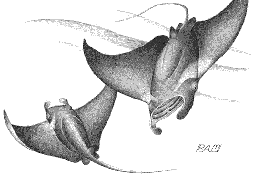
Some mantas.

A Zodiac-type boat, like the ones I imagined the hunters in my book used when pursuing beasts.
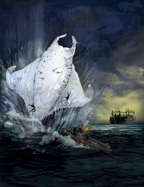
Lia’s first version far exceeded my expectations. I’d suggested she do a rough, pencil sketch, but she decided to create an actual sample cover. I loved it, but realized that having the zodiac and men so close to the beast would give the reader a sense of the beast’s size, which I preferred to leave mysterious.
Lia gamely tried again. The two barely visible survivors in the foreground (lower right) would have been made to look more realistic. But since I thought of this as only an example of what the cover might look like, I didn’t want her to put any more time into it. After all, this “sample” was certainly enough to give the publisher an idea of what I hoped the cover might look like.
I sent it off.
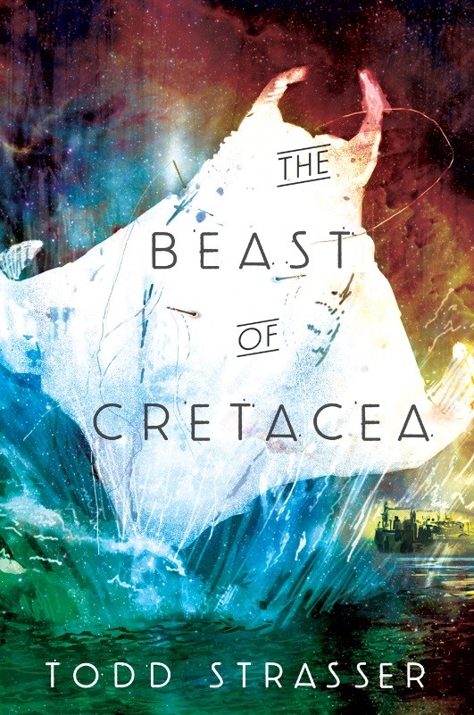
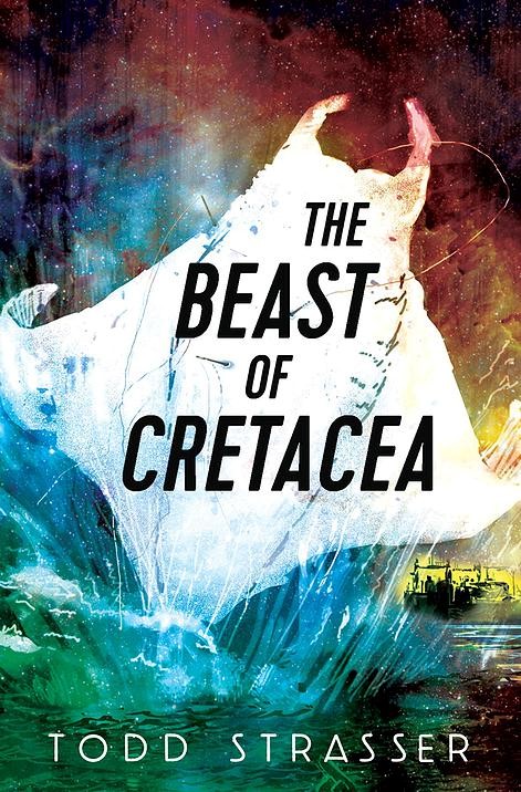
Here’s what came back. I was stunned... and delighted! They wanted to use Lia’s sample as the actual cover!

The art director at Candlewick had added a background that would convey a sense of space travel. This Hubble telescope image isn’t the exact background, but I think it must have served as inspiration. The art director also moved the ship under the beast’s wing to make the image of the creature as large as possible on the cover. But it was still Lia’s drawing! She had one more suggestion: that the title font be bolder.
Thar she blows!
Todd Strasser is the author of more than 140 books for teens and pre-teens. His books have been translated into more than a dozen languages, and several have been adapted into feature films. He has also written for television, newspapers, and magazines such as The New Yorker, Esquire and The New York Times. His most recent novels are the YA thrillers WISH YOU WERE DEAD, BLOOD ON MY HANDS and KILL YOU LAST.
